Creating a unified identity through Firemark Collective's website.
Firemark Labs is the innovation hub of IAG, the largest general insurer in Australia and New Zealand. In 2021, a corporate restructure was implemented to unify us with two other separate entities under the Firemark brand. Our in-house scrum team was assembled to create a new corporate website to support this restructure.
Client
Firemark Collective
2021
My areas of focus
User Experience
Brand Storytelling
Problem
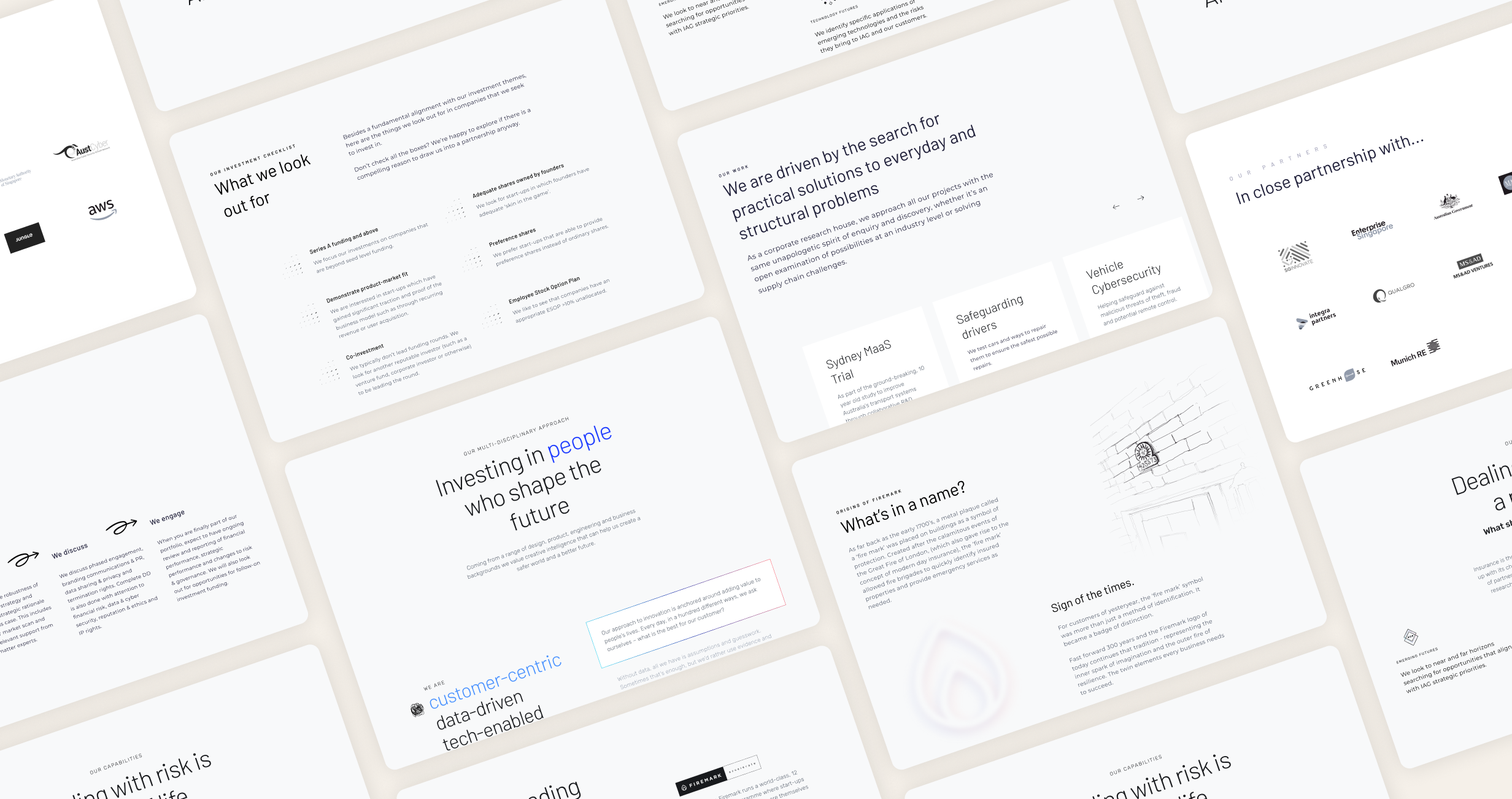
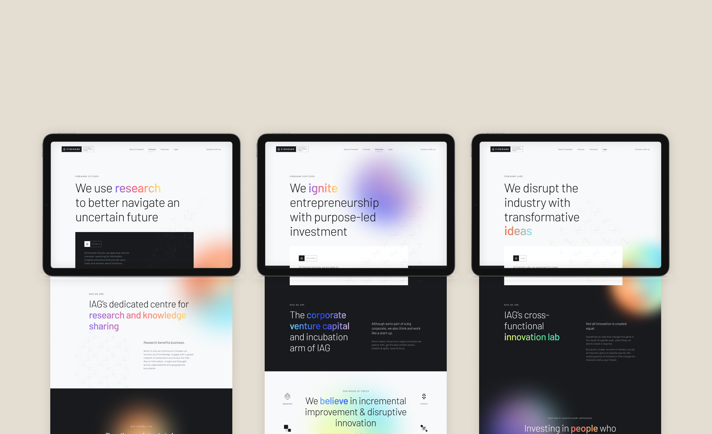
Firemark's stakeholders
needed to express themselves accurately in their respective identities of a research centre, venture capitalist, and an experimental incubator.
Firemark’s business partners
needed to understand what Firemark Collective means and how it can be valuable to them.
Firemark’s employees
needed to understand how they should relate with colleagues from other teams which previously worked in silo.
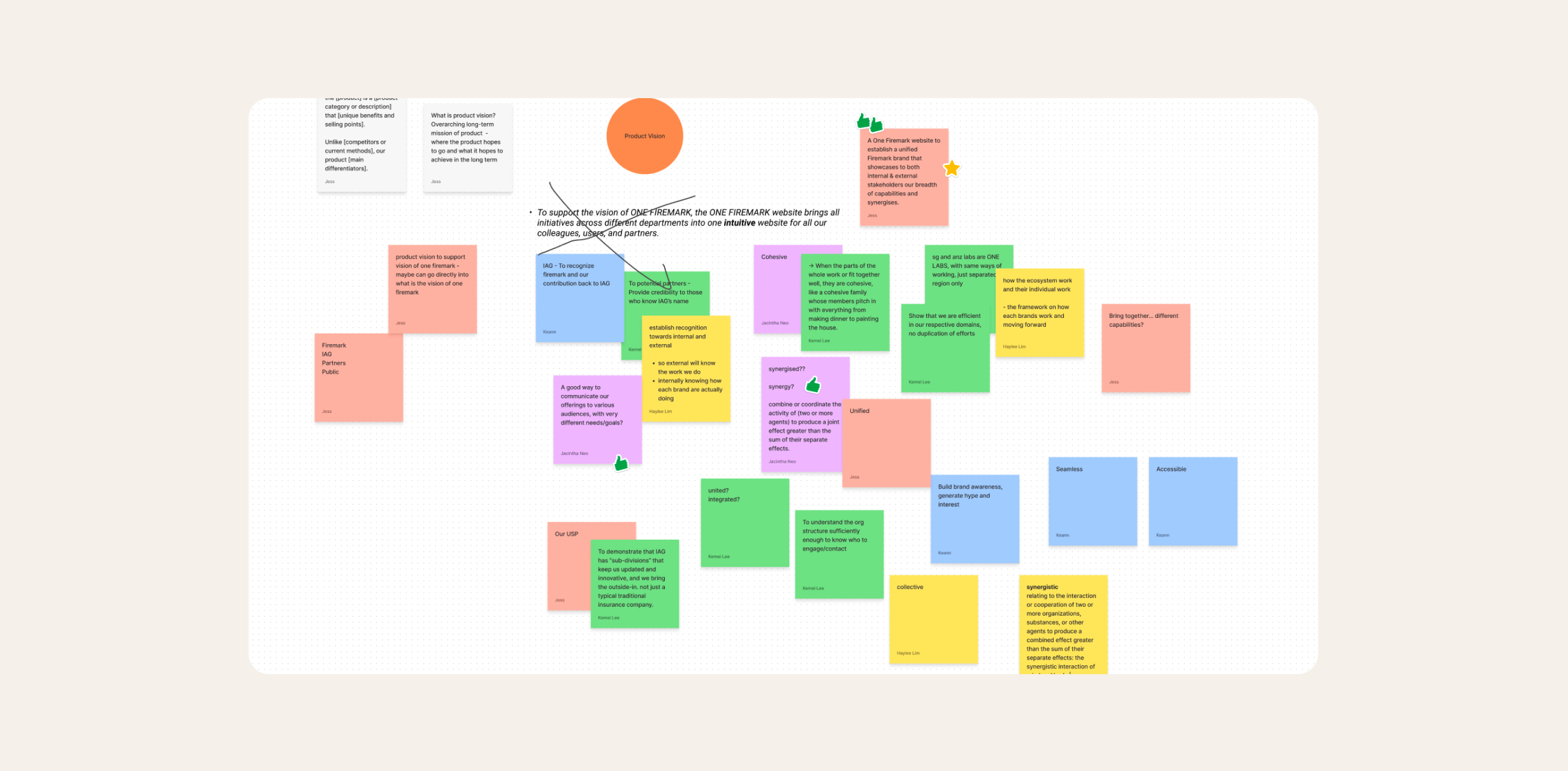
Vision
A One Firemark website that serves as a new mental model on Firemark’s unity, uniqueness and synergies, for internal staff and external stakeholders alike.
Project Methodology
We followed a dual-track agile (Scrum) approach in 2-week sprints, to complete the first release of the website. This meant close collaboration between scrum developers (designers and engineers) through rituals like Sprint Plannings, Daily Scrums, Sprint Reviews, and Sprint Retrospectives.
Research Approach
Stakeholder workshops
As this project involved international stakeholders of previously siloed teams, hands-on workshops and constant communication was crucial to ensure all voices were heard.
Usability Testing
Early in the project, we conducted 2 rounds of UT with 3 participants each. This was tested on clickable prototype wireframes, and focused on the navigation and content structure.
Guerrilla Testing
As we developed our UI concepts further, we conducted quick tests with friends and colleagues to validate the intuitiveness of some of the more adventurous UI interactions we explored.
Usability Testing – Iteration 1
Our main objectives in our first usability test was to check if the high-level information architecture was effective in helping users navigate, as well as get to know the 3 domains of Firemark (Futures, Ventures and Labs).
Navigation bar and menu were tested in mid-fidelity, as we were experimenting on visual aids that could help users understand how the pages related to each other. We also took the chance to do initial testing of the section contents for each page, which were in very low fidelity.
Clarification required on Futures, Ventures, and Labs
Some participants thought these functions were projects under Firemark. The website did not aid users in understanding what these functions meant and how they related to each other.
Confusion over the display of respective function logos
There was slight confusion over the fact that there were two logos displayed at once. Some mistakenly assumed that the functions logos can be clicked to access a dedicated page.
Secondary navigation was a hit and miss
Some participants had expected all items in the first tier navigation bar in desktop view were clickable, when they were not. The full width dropdown in mobile was also surprising to users and some felt it was taking too much space.
Design placement decisions were validated
The good news was that participants easily identified the location of the careers section and contact us. We also observed that they relied on the footer for site navigation to a certain extent. Participants also had correct expectations on where buttons will lead them.
Usability Testing – Iteration 2
Based on the findings, we redesigned how the navigation bar and menu worked. The improvement in response was positive and gave us the confidence to continue designing in this new direction.
Better understanding of functions
Participants noted that the short explainer text helped them conceptualise what each of the functions meant.
Navigation was smooth
Participants successfully navigated across pages using the top navigation bar (desktop) and hamburger menu (mobile).
Appreciation for micro-delights
Participants expressed excitement over seeing small little touches, such as gradient glows in the desktop and mobile navigation.
Inconclusive results on dynamic logo
We experimented with dynamic logo whereby it alternated in showing the 3 functions logos in sequence. Two participants were able to understand and interact with it, but one had difficulties.
Wireframes
As the UX designer, my role was to create wireframes with a tight narrative and close-to-finalised content, taking into account input from all stakeholders and copywriter. The wireframes were then handed off to the UI designers to explore on visual design, with whom I continued to work closely with to ensure that the original intention of information hierarchy and placement is communicated. I also helped the UI designers prototype their intended animation to better communicate the concepts to the engineers.
Design Features
A single, unified brand
To portray a unified front and rally the functions together as an organisation, each of the functions’ landing pages followed a similar template and visual. Keeping to a familiar structure also has the added benefit of reducing the cognitive load of users, allowing them to focus more on the content and understanding each functions’ uniqueness.
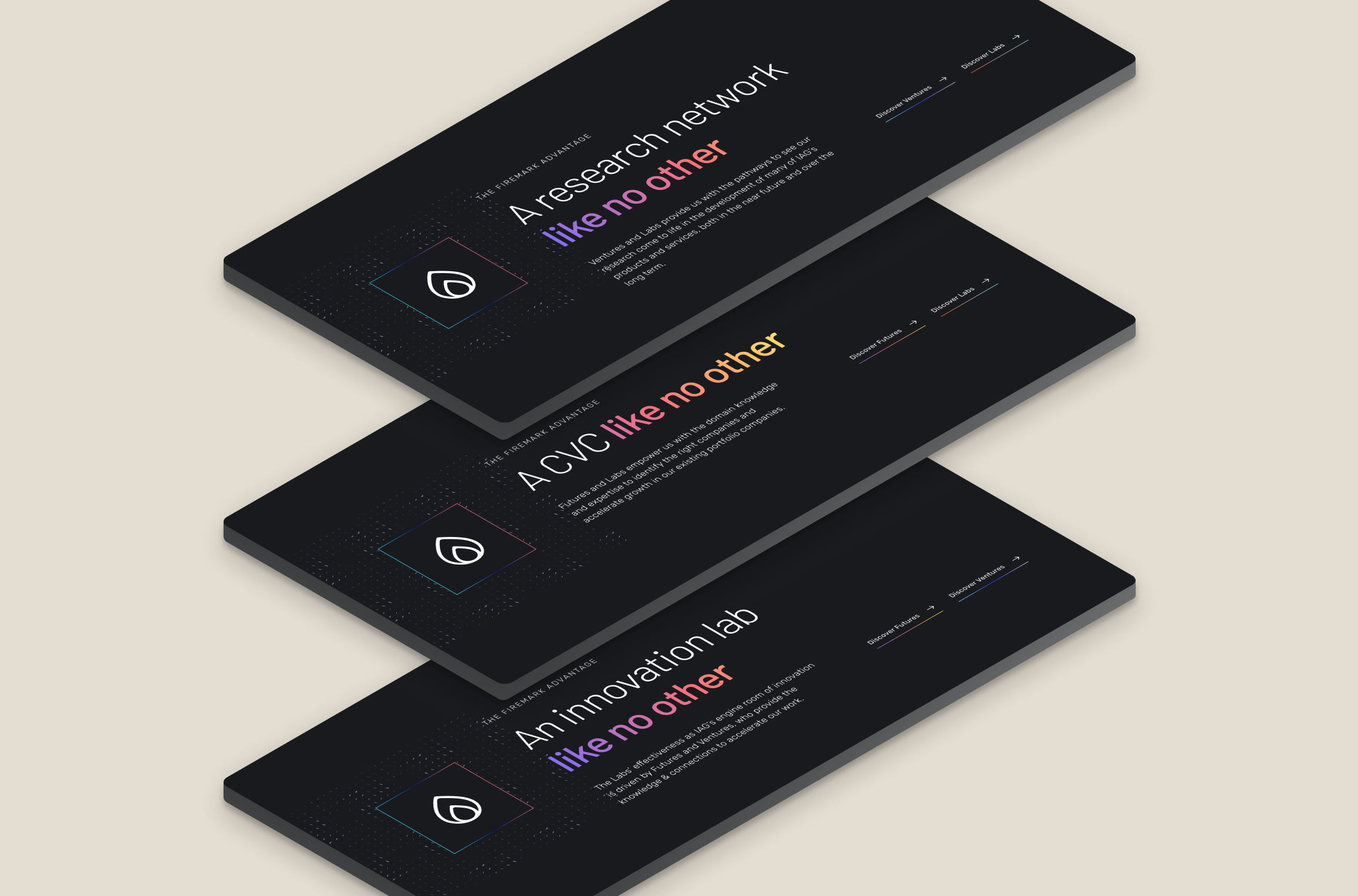
Emphasising synergies
To highlight how the three functions complement each other, we added a call-out banner at the bottom of each function’s landing page. This succinctly explains how each function was supported by the other two, and included hyperlinks to guide users to the relevant landing pages for more information.
Guiding users to contact Firemark
To simplify the process of contacting Firemark, we created a single contact page with a tab-based interface. This approach allows users to choose the reason for their contact and get personalised guidance and appropriate links for us to better assist their needs. We also link users directly to the relevant tab based on whether they had navigated from in the website.
Process and experience
A love for collaboration
This was personally one of my favourite projects I have been involved in. I experienced the value of having a collaborative team supported by a scrum master. Working in the scrum methodology allowed us to focus on our respective skill sets, while being extremely attuned to the needs of other team members and adjusting accordingly.
For example, engineering hurdles like creating of data visualisation were communicated upfront so designers and engineers could both explore coming up with easy-to-code graphs that also serve it’s purpose and are visually appealing.
Reach me at